
Empire is the world's leading film magazine and proved easy to find some influential front covers. I liked how the magazine always places the text behind an object/character, so I used the same style in our own magazine front cover. At first I had trouble doing this, as I wasn't too sure how to fulfill this effect. I simply looked on Bing.com and found a tutorial. I used Adobe Photoshop CS3 to complete this action, as it's a programme I use in other subjects and for personal use.
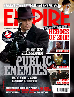
I used this front cover to look at the wording of advertisement. For example when Empire states "First Look", I also wanted to add this exclusive peak to advertise. On our final draft of the front cover, I used 'World Exclusive' and 'First look at the wanderer', to give the same the effect but creating a subheading of world exclusive. I made subheadings like this to keep the arrangement of the poster neat, keeping to that old fashioned western theme.
I also noticed that Empire have their own organisation of headings, always using 'Plus!' as a subheading for inside contents. I thought this was an effective way of targeting an audience, as it allows people to read the front cover and get an insight to what it contains. On our poster I made the sub heading 'More' to keep to our formal appearance I didn't use an exclamation mark.
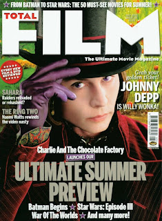
Another well known film magazine is Total Film, who review trailers, films and film news. They're titling is often large, and make their heading cover a quarter of the page. Whilst creating the front cover, I noticed 'Total Film' use the same fonts in their layout or the same colour scheme. After learning this I thought the front cover would be neater if I kept the font the same on the cover, but I did vary this when adding film names. I felt adding the film names in a different font adds their own advertising to the front cover.
 Empire is the world's leading film magazine and proved easy to find some influential front covers. I liked how the magazine always places the text behind an object/character, so I used the same style in our own magazine front cover. At first I had trouble doing this, as I wasn't too sure how to fulfill this effect. I simply looked on Bing.com and found a tutorial. I used Adobe Photoshop CS3 to complete this action, as it's a programme I use in other subjects and for personal use.
  I used this front cover to look at the wording of advertisement. For example when Empire states "First Look", I also wanted to add this exclusive peak to advertise. On our final draft of the front cover, I used 'World Exclusive' and 'First look at the wanderer', to give the same the effect but creating a subheading of world exclusive. I made subheadings like this to keep the arrangement of the poster neat, keeping to that old fashioned western theme.
  I also noticed that Empire have their own organisation of headings, always using 'Plus!' as a subheading for inside contents. I thought this was an effective way of targeting an audience, as it allows people to read the front cover and get an insight to what it contains. On our poster I made the sub heading 'More' to keep to our formal appearance I didn't use an exclamation mark.
 Another well known film magazine is Total Film, who review trailers, films and film news. They're titling is often large, and make their heading cover a quarter of the page. Whilst creating the front cover, I noticed 'Total Film' use the same fonts in their layout or the same colour scheme. After learning this I thought the front cover would be neater if I kept the font the same on the cover, but I did vary this when adding film names. I felt adding the film names in a different font adds their own advertising to the front cover.


