Showing posts with label Ancillary Task Poster. Show all posts
Showing posts with label Ancillary Task Poster. Show all posts
Wednesday, 9 May 2012

Monday, 26 March 2012


Friday, 10 February 2012
Post Production: Draft Two
After looking through Internet images of any influential poster ideas, I managed to collect a few conventions of a poster. The films I looked at were True Grit (2010), Casino Royale (2006), Inglorious Basterds (2009) and The Dark Knight (2008).


I used these posters to get an idea of how a teaser poster looks in terms of, layout, font, size of text, design and colour. Each poster individually helped me create the teaser poster with the suitable conventions of a teaser in place.
In terms of development we worked as a team to portray a poster as effective as possible with the equipment we had. From the draft one to our final draft, there are noticeable improvements to the quality of work.


As we tried different images, we realised it is crucial to maintain the idea of being a 'teaser'. Therefore we needed to make sure that little information was given away and keep the design of the poster neat. After looking through more posters we had an attraction to making the image of John Walters a shadow. As an editor this task was challenging as I had to cut out John Walters character and expose the shadow clearly. To do this I masked off section of the characters body, and had erased it. This appeared rigid and messy, so I used a range of tools to blur, burn and smudge areas. These tools blended pixels together, therefore reducing the rigid appearance and creating a bold outline. In addition to this I manipulated the image itself, adding darkness by adjusting the contrast and brightness.
Post Production: Draft One
To create the poster I used the graphic editing software Adobe Photoshop CS3. As the CS3 version isn't the newest product Adobe had made, it was easier to get different tutorials because of how long it has been in use. Also I found it easier to work with because I work with Adobe Photoshop CS3 in other subjects.
 Firstly I emphasised the influence of black within the photo,creating an ominous presence. I achieved this by 'masking' the areas behind the character John Walters, then filling the area I had selected with black. I also added the title of the film, placing it on the black in a white font so it stood out. I carried on using the same font, used throughout the film. Once I had added the title, I placed the logo that represents our production team and then other logos that existed within our film.
 To make the logos appear more effective I had to erase all the white areas around the image. Furthermore I decided to retouch all the rigid areas around the 'Four Horsemen' logo, by zooming in on the photo showing all the uneven pixelated areas. I simply erased the uneven edges, using the 'eraser tool'. It was vital I organised my work accordingly, placing different steps into 'layers'. Layers are in Adobe Photoshop to hold part of an image or a whole image, create exacting adjustments to our images, combine multiple images, or create new images. They are effects or images that have been placed into the programme by the editor, which then can be organised into groups or named.
Wednesday, 8 February 2012
John Walters Analytical Poster Review

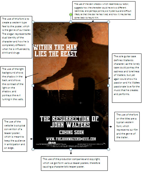
For our poster, which is in the process of being edited, we have a shadowed figure in the background, which may show the audience that the main character is a strange yet mysterious person. This may also show the possibility of a split personality problem, and how he has not got a clear idea for himself.
The use of light on the back wall, suggests how Walters may be moving forwards into the light and into a brighter future, especially suggesting the way that his shadow is facing. It may also suggest the use of a split personality once again with the use of the light with him dark, perhaps suggesting how he is in a different mindset.
The use of the lonely guitar case resembles Walters past, as he has been very troubled, and has gone through a rough patch in his career. The Guitar case also represents strength to the audience, as it stands there alone, it can relate to Walters, how he has to battle his own wars alone with alcohol and drug abuse without any help.
The use of font for our poster is Vanilla White; we chose this because it gave the best effect of a western genre. The wording is very western like, but also gives a slight hint of the godfather, with the lines blurring off to the side.
The use of the website on our poster is to give the idea of a real poster convention; therefore like the posters we studied such as Inception, they all had links to their websites at the bottom of the poster.
The use of production companies at the bottom of the page is another typical convention of film posters, as this is shown with the posters in Gran Torino and Inception. It sometimes has links to the production company’s websites, which can give more information into the existing film.
Tuesday, 24 January 2012
Feedback: Ancillary Task Poster
I have been working on our film's teaser poster and need feedback but mainly to try and decide what font would be best.
Here are some images below...


Here are some images below...


Monday, 9 January 2012
Feedback: Teaser Poster
The audience feedback was really productive for us as a group; we got feedback on both our poster and magazine.
Poster:
Font is too big for the proportion of the poster
The website should be changed as it is unrealistic and usually has movie or film added at the end of the URL
Like the image as it stands out
The title of the film ‘The Resurrection of John Walters’ should be lowered as this will fit in with the shadow
Like the use of the production companies at the bottom, looks very professional
Good use of props and clothing
Good use of lighting
Tagline could be shorter
Poster:
Font is too big for the proportion of the poster
The website should be changed as it is unrealistic and usually has movie or film added at the end of the URL
Like the image as it stands out
The title of the film ‘The Resurrection of John Walters’ should be lowered as this will fit in with the shadow
Like the use of the production companies at the bottom, looks very professional
Good use of props and clothing
Good use of lighting
Tagline could be shorter
Wednesday, 14 December 2011
Poster Analysis- John Walters

We used a light background on Jimmy’s front side to firstly show him in colour, but secondly the use of the black shadow behind him to show how his character is somewhat confused, and shows a sense of insecurity and uncertainty.
Here we have the use of writing in our title and the tagline which stands out as it is white on black. We used the font Engravers MT as it gave us the impression of a western film genre, and also gave us our own feel. As we created this poster ourselves.
Here we have our actor, Jimmy, who is posing as a washed up country singer, who is slowly regaining his stardom, to create this we used the correct costume such as shirt and tie, to portray a singer who is slowly coming back. We also used a guitar case, to make the storyline clearer for our audience. The use of lighting was also used to show how our character has turned away from his past, and is now living a new life.
The use of lighting was specifically used to show how our character has changed his ways, and is now living a new life, the lighting effect was also brilliant as it created a shadow effect behind Jimmy
The use of titles was included as this is one of our own production companies in which we created, specifically for the resurrection of John Walters. We also made our own website and pictures companies.
Monday, 10 October 2011
Post Production
 This image was taken infront of a green screen, to make the editing process easier. I experimented with this picture, creating multiple examples of review ideas.
 With this image I had the idea to manipulate the shadow and tone of the image. I converted the colour tone to sepia, portraying an 'old-fashioned' effect. Furthermore the sepia tone distorted the quality of the image, emphasising the old style effect I was trying to achieve.
  The main issue with this image was the photo wasn't taken on a blank background. Therefore editing was difficult when selecting and manipulating the image. I had to black out the entire background and remaster the position of objects.
  This was our final chosen image to use for our magazine front cover. We decided as a group this was the most effective and neat image for a magazine cover. I managed to manipulate this photo, by adjusting the brightness, contrast and tone of the image. Furthermore I added the title of the cover and placed it behind the character, similar to the 'Empire' magazine.
 Another Edited rough copy of a movie poster.

We think this looks like more of an album cover rather than a teaser poster. Still i think it is a cool concept with the tag line which is a convention for the movie poster. And "COMING SOON" is also a convention that we stuck too and used. The logos at the bottom are always used for movie posters aswell. Again this is like the Clint Eastwood poster we posted previous. It also has a great sixties feel to it with the Ray Ban sun glasses. Again this is a rough draft and is not our offical movie teaser poster.
Production: Draft Idea

Here is a very roughly edited teaser poster that was edited from an old photo we found in our files on a memory stick. This is not our official movie teaser poster but just a rough draft we liked. It follows the conventions of a Johnny Cash album cover but not the same size. As you can see it is very minimalistic in terms of text only the title can be seen & there is no tagline.
It is supposed to look like John Walters the character is standing on stage in all his glory with his guitar on his back in an iconic Johnny Cash like pose. The spotlight is focused on the character and the text is very minimalistic showing classic conventions of a movie poster.
Wednesday, 5 October 2011
production teaser poster 5/10/11
In today's lesson we decided to shoot our final ideas for our teaser poster. We decided to shoot these photos in one of the school's drama studios, our initial thought to shoot there was because it was being refurbished, and gave that typical run-down look, which is ideal for our photos and our genre. We also borrowed the photography lights form the art block, this gave us the opportunity to change the focus of the lights, therefore we could create many different shots and angles of the light for our actor. We also used different props such as clothing, a guitar and a case for the guitar, all of these were used to portray a western genre.
We had to use an extension lead for the lights, as well as having a huge piece of scaffolding right next to the lights, which did obstruct us at times, although I believe we made it work to the best of our ability.
We had to use an extension lead for the lights, as well as having a huge piece of scaffolding right next to the lights, which did obstruct us at times, although I believe we made it work to the best of our ability.
Monday, 3 October 2011
Teaser Poster

This is not a final copy of our film teaser poster but it is a work in progress and i just wanted to show the sort of look we are going for. As you can see it is very minimalistic in terms of colour which reflects the tone and mood of the film. I like this close up side profile shot because it's almost like there is something different on the other side of his face which then leads onto viral marking and enigmas.
There is no font of writing on it yet. Obviously if this was our poster people would be asking what it is about because all it seems to be is a shot of a man with glasses on. Once a suitable tagline is fitted onto the poster such as "THE HARDER THE LIFE, THE SWEETER THE SONG" it will become a lot clearer in terms of what genre this film fits into. There is a certain class to this photo though black and white i feel pays respects to the old school film making methods. We are currently in the process on editing a final poster but we are thinking of making several ones as we want to explore what we can do with photoshop and green screened picture taking.
Friday, 23 September 2011
lesson work since summer
Since the Summer break we have been working hard in concluding our production, which has included editing and other range of work such as final production pieces to upload to the blog such as poster analysis, teaser trailer analysis and magazine front covers to analysis.
We are stuggling to find the soundtrack to the johnny cash song 'hurt', if we are unable to pursue this work we will then have to turn to the song 'beast in me'.
We have started editing, but it is a slow progress, as we would like to take our time to create a good piece of successful work. The reason why the editing process is coming along slowly is because to create a successful piece of work you must take your time in order for it to work.
We have set ourselves some deadlines to finish our final piece of work in order to make everyone work just as hard and completely finish our whole production, and hopefully it will be a huge success.
We are stuggling to find the soundtrack to the johnny cash song 'hurt', if we are unable to pursue this work we will then have to turn to the song 'beast in me'.
We have started editing, but it is a slow progress, as we would like to take our time to create a good piece of successful work. The reason why the editing process is coming along slowly is because to create a successful piece of work you must take your time in order for it to work.
We have set ourselves some deadlines to finish our final piece of work in order to make everyone work just as hard and completely finish our whole production, and hopefully it will be a huge success.
Subscribe to:
Posts (Atom)