
Showing posts with label Ancillary Magazine Front Cover. Show all posts
Showing posts with label Ancillary Magazine Front Cover. Show all posts
Wednesday, 9 May 2012

Friday, 10 February 2012
Magazine Front Cover Analysis

We wanted the title to be big and bold, as this would stand out for our target readers., also with the bold white writing on a dark background, it stood out even more.
With the title, we decided to use a typical western font, as this was the correct decision considering our film was within the western genre, also knowing that the title is exactly by a picture of the main character enables the reader to understand what the magazine cover is about. We had some small issues with jimmy’s head, as at first we could not put it over the title until we cropped it.
The use of different films congealed on a certain side of the cover is a typical magazine convention, and engages a reader to buy the magazine and read on. The use of different fonts for the films was to show how all the films have an individual identity.
The use of the sub-heading ‘world exclusive’ is another typical magazine convention, and we used this heading, as it was used often on many professional magazine covers.
Once again the use of the sub-headings are typical magazine conventions, and give the reader a slight insight into what they expect to see within the magazine.
With the picture being in the middle of the page, it enabled us to consider over conventions such as the headings, title, barcodes and the use of font.
The use of the barcode, is a usual convention for any magazine, and we after looking at many different magazine front covers, the majority of the barcodes were in the bottom right hand corner of the page.
Monday, 6 February 2012
6th February 2012
Final production work is eventually being tied up and completed now, and should be completed shortly. The poster has been evaluated and completed, and we are just waiting for other members of the group to upload them. Our evaluation is also near conclusion; the only thing we are waiting for is the upload of the final pictures to the evaluation.
Our magazine cover is also near to being finished, with just a few, small adjustments being needed to try and perfect our cover, we were having obvious problems with the titles and sub-headings along the side of the front cover. We had problems with the 100 greatest performances, which seemed strange for a magazine cover. For the fonts, we had numerous different fonts for the magazine cover, therefore causing a lack of continuity running through our front cover.
Our magazine cover is also near to being finished, with just a few, small adjustments being needed to try and perfect our cover, we were having obvious problems with the titles and sub-headings along the side of the front cover. We had problems with the 100 greatest performances, which seemed strange for a magazine cover. For the fonts, we had numerous different fonts for the magazine cover, therefore causing a lack of continuity running through our front cover.
Monday, 9 January 2012
Feedback: The Magazine Cover
The magazine cover was interesting and gave us many responses which would allow us to further our progress such as:
The font of the magazine could be smaller and clearer to see
Some of the titles on the sides of the cover could be clearer, and more thought of
The image is good, and gives a clear picture of the film
The use of lighting is good showing a light side and a dark side of the film
The barcode at the bottom of the page could be turned flat
The price of the magazine is too big for the proportion of the magazine
Good title very big and bold, makes it stand out to the reader
The font of the magazine could be smaller and clearer to see
Some of the titles on the sides of the cover could be clearer, and more thought of
The image is good, and gives a clear picture of the film
The use of lighting is good showing a light side and a dark side of the film
The barcode at the bottom of the page could be turned flat
The price of the magazine is too big for the proportion of the magazine
Good title very big and bold, makes it stand out to the reader
Monday, 10 October 2011
Post Production
 This image was taken infront of a green screen, to make the editing process easier. I experimented with this picture, creating multiple examples of review ideas.
 With this image I had the idea to manipulate the shadow and tone of the image. I converted the colour tone to sepia, portraying an 'old-fashioned' effect. Furthermore the sepia tone distorted the quality of the image, emphasising the old style effect I was trying to achieve.
  The main issue with this image was the photo wasn't taken on a blank background. Therefore editing was difficult when selecting and manipulating the image. I had to black out the entire background and remaster the position of objects.
  This was our final chosen image to use for our magazine front cover. We decided as a group this was the most effective and neat image for a magazine cover. I managed to manipulate this photo, by adjusting the brightness, contrast and tone of the image. Furthermore I added the title of the cover and placed it behind the character, similar to the 'Empire' magazine.
 Photo shoot. Wednesday the 5th of October.

This is an example of one of the photos taken on Wednesday. The intention of these photos was to use them for our magazine front cover. We thought by using this back ground we could straight away elminate creating a back ground on photoshop. Simply because the back ground here is perfect its dingy and minimalistic. I also feel it looks alot like an Empire Magazine front cover because the photos are usually taken way before the production has even started. Almost like the photo is taken especially for the magazine front cover in some sort of contract.
As you can see we have decided to have the character in costume rather than the main actor in a suit. We decided to do this because we wanted to stick to the conventions of many other movie magazine covers. We also decided that it would be significant having a large shadow cast on the wall behind the character as it shows a potentional split-personality problem. Clearly this is no edited yet but we are currently working on our official magazine front cover right now.
Friday, 23 September 2011
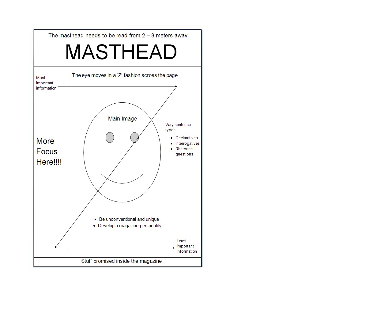
Magazine Cover conventions

After looking at several magazine conventions I decided to create this visual template to show how a magazine front cover is able to successful spread their information across the page and capture the attention of any passing consumer. (Please click on the image above) I have created the template in this fashion because humans read from left to right that is why the magazines main information is situated on the left hand side because it is going to be the first thing people are going to read. Also the magazine front cover needs to have is own unique personality that way it can be easily distinguished if it is surrounded by other magazines in a newsagents.
lesson work since summer
Since the Summer break we have been working hard in concluding our production, which has included editing and other range of work such as final production pieces to upload to the blog such as poster analysis, teaser trailer analysis and magazine front covers to analysis.
We are stuggling to find the soundtrack to the johnny cash song 'hurt', if we are unable to pursue this work we will then have to turn to the song 'beast in me'.
We have started editing, but it is a slow progress, as we would like to take our time to create a good piece of successful work. The reason why the editing process is coming along slowly is because to create a successful piece of work you must take your time in order for it to work.
We have set ourselves some deadlines to finish our final piece of work in order to make everyone work just as hard and completely finish our whole production, and hopefully it will be a huge success.
We are stuggling to find the soundtrack to the johnny cash song 'hurt', if we are unable to pursue this work we will then have to turn to the song 'beast in me'.
We have started editing, but it is a slow progress, as we would like to take our time to create a good piece of successful work. The reason why the editing process is coming along slowly is because to create a successful piece of work you must take your time in order for it to work.
We have set ourselves some deadlines to finish our final piece of work in order to make everyone work just as hard and completely finish our whole production, and hopefully it will be a huge success.
Subscribe to:
Posts (Atom)