Showing posts with label Jamie Ward. Show all posts
Showing posts with label Jamie Ward. Show all posts
Wednesday, 9 May 2012

Monday, 26 March 2012


Friday, 10 February 2012
Magazine Front Cover Analysis

We wanted the title to be big and bold, as this would stand out for our target readers., also with the bold white writing on a dark background, it stood out even more.
With the title, we decided to use a typical western font, as this was the correct decision considering our film was within the western genre, also knowing that the title is exactly by a picture of the main character enables the reader to understand what the magazine cover is about. We had some small issues with jimmy’s head, as at first we could not put it over the title until we cropped it.
The use of different films congealed on a certain side of the cover is a typical magazine convention, and engages a reader to buy the magazine and read on. The use of different fonts for the films was to show how all the films have an individual identity.
The use of the sub-heading ‘world exclusive’ is another typical magazine convention, and we used this heading, as it was used often on many professional magazine covers.
Once again the use of the sub-headings are typical magazine conventions, and give the reader a slight insight into what they expect to see within the magazine.
With the picture being in the middle of the page, it enabled us to consider over conventions such as the headings, title, barcodes and the use of font.
The use of the barcode, is a usual convention for any magazine, and we after looking at many different magazine front covers, the majority of the barcodes were in the bottom right hand corner of the page.
Wednesday, 8 February 2012
John Walters Analytical Poster Review

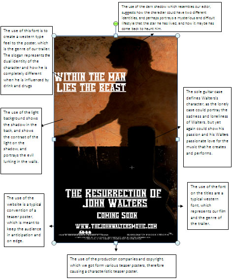
For our poster, which is in the process of being edited, we have a shadowed figure in the background, which may show the audience that the main character is a strange yet mysterious person. This may also show the possibility of a split personality problem, and how he has not got a clear idea for himself.
The use of light on the back wall, suggests how Walters may be moving forwards into the light and into a brighter future, especially suggesting the way that his shadow is facing. It may also suggest the use of a split personality once again with the use of the light with him dark, perhaps suggesting how he is in a different mindset.
The use of the lonely guitar case resembles Walters past, as he has been very troubled, and has gone through a rough patch in his career. The Guitar case also represents strength to the audience, as it stands there alone, it can relate to Walters, how he has to battle his own wars alone with alcohol and drug abuse without any help.
The use of font for our poster is Vanilla White; we chose this because it gave the best effect of a western genre. The wording is very western like, but also gives a slight hint of the godfather, with the lines blurring off to the side.
The use of the website on our poster is to give the idea of a real poster convention; therefore like the posters we studied such as Inception, they all had links to their websites at the bottom of the poster.
The use of production companies at the bottom of the page is another typical convention of film posters, as this is shown with the posters in Gran Torino and Inception. It sometimes has links to the production company’s websites, which can give more information into the existing film.
Monday, 6 February 2012
6th February 2012
Final production work is eventually being tied up and completed now, and should be completed shortly. The poster has been evaluated and completed, and we are just waiting for other members of the group to upload them. Our evaluation is also near conclusion; the only thing we are waiting for is the upload of the final pictures to the evaluation.
Our magazine cover is also near to being finished, with just a few, small adjustments being needed to try and perfect our cover, we were having obvious problems with the titles and sub-headings along the side of the front cover. We had problems with the 100 greatest performances, which seemed strange for a magazine cover. For the fonts, we had numerous different fonts for the magazine cover, therefore causing a lack of continuity running through our front cover.
Our magazine cover is also near to being finished, with just a few, small adjustments being needed to try and perfect our cover, we were having obvious problems with the titles and sub-headings along the side of the front cover. We had problems with the 100 greatest performances, which seemed strange for a magazine cover. For the fonts, we had numerous different fonts for the magazine cover, therefore causing a lack of continuity running through our front cover.
Monday, 9 January 2012
Feedback: The Magazine Cover
The magazine cover was interesting and gave us many responses which would allow us to further our progress such as:
The font of the magazine could be smaller and clearer to see
Some of the titles on the sides of the cover could be clearer, and more thought of
The image is good, and gives a clear picture of the film
The use of lighting is good showing a light side and a dark side of the film
The barcode at the bottom of the page could be turned flat
The price of the magazine is too big for the proportion of the magazine
Good title very big and bold, makes it stand out to the reader
The font of the magazine could be smaller and clearer to see
Some of the titles on the sides of the cover could be clearer, and more thought of
The image is good, and gives a clear picture of the film
The use of lighting is good showing a light side and a dark side of the film
The barcode at the bottom of the page could be turned flat
The price of the magazine is too big for the proportion of the magazine
Good title very big and bold, makes it stand out to the reader
Feedback: Teaser Poster
The audience feedback was really productive for us as a group; we got feedback on both our poster and magazine.
Poster:
Font is too big for the proportion of the poster
The website should be changed as it is unrealistic and usually has movie or film added at the end of the URL
Like the image as it stands out
The title of the film ‘The Resurrection of John Walters’ should be lowered as this will fit in with the shadow
Like the use of the production companies at the bottom, looks very professional
Good use of props and clothing
Good use of lighting
Tagline could be shorter
Poster:
Font is too big for the proportion of the poster
The website should be changed as it is unrealistic and usually has movie or film added at the end of the URL
Like the image as it stands out
The title of the film ‘The Resurrection of John Walters’ should be lowered as this will fit in with the shadow
Like the use of the production companies at the bottom, looks very professional
Good use of props and clothing
Good use of lighting
Tagline could be shorter
Wednesday, 14 December 2011
Poster Analysis- John Walters

We used a light background on Jimmy’s front side to firstly show him in colour, but secondly the use of the black shadow behind him to show how his character is somewhat confused, and shows a sense of insecurity and uncertainty.
Here we have the use of writing in our title and the tagline which stands out as it is white on black. We used the font Engravers MT as it gave us the impression of a western film genre, and also gave us our own feel. As we created this poster ourselves.
Here we have our actor, Jimmy, who is posing as a washed up country singer, who is slowly regaining his stardom, to create this we used the correct costume such as shirt and tie, to portray a singer who is slowly coming back. We also used a guitar case, to make the storyline clearer for our audience. The use of lighting was also used to show how our character has turned away from his past, and is now living a new life.
The use of lighting was specifically used to show how our character has changed his ways, and is now living a new life, the lighting effect was also brilliant as it created a shadow effect behind Jimmy
The use of titles was included as this is one of our own production companies in which we created, specifically for the resurrection of John Walters. We also made our own website and pictures companies.
Wednesday, 7 December 2011
Wednesday 7th December
In today’s lesson we have finished the editing of our evaluation, and are now looking for specific pictures to add into our final evaluation, we have edited all of our evaluation including the sound, and we are now biding our time, looking for pictures to include into our evaluation. As the producer I am closely watching over the process of the evaluation, and watching closely at the editing.
Wednesday 23rd November
Today we have started and completed our evaluations, which included talking about production work, editing, and research and planning. All these areas were key as this was essential for us creating a professional and successful looking trailer, all of which were included in our evaluation. As our entire group members had different roles, so therefore we had to talk about our specific roles, and how we helped the group to create a successful trailer.
Monday 21st November
We have finally overcome our problems with the editing of our poster and magazine cover. We used a specific technique on Adobe Photoshop called masking, which allowed us to go around Jimmy’s head, and put the title behind his head, this was a great achievement for us, as we had never used masking in any editing process before. Our poster was also a success as we used a technique which also allowed us to mask around jimmy’s body and therefore, out a jet black background, showing a mysterious shadow lingering over jimmy, as stated in previous posts, this is because we wanted to create an unclear character.
Wednesday 9th November
Both the poster and magazine covers have hit a small stumbling block as the editing process on both have become very tricky to understand and complete, therefore, causing our editors a slight problem in completing them. We are having problems with Adobe Photoshop as our Title is going in front of our lead actors head, therefore making the poster look unrealistic and scruffy. We are also having a problem with the background, as we cannot colour around our character without colour going over him, we are working together in trying to solve these minor issues.
Wednesday 2nd November
Now all of our production work was complete we then had to move on to the editing of our poster and magazine cover. This proved difficult for us as we had hundreds of photos to choose from. Through the choosing process, we wanted to create something that would stand out, but also represent what our character was about, as our character comes across as a drunken mess who is unclear in what way his life is heading. So we thought having a dark background on one side, and a light shining on the other, would represent a clear and maybe mistaken character, and how his life is slowly transforming.
With our magazine cover we wanted to create something that was eye-catching, and would intrigue the reader, we included added incentives, such as other films we had thought of, and put them on our front cover, for this we used different fonts to show how they all have their own styles and different representations. Then we thought that this would be a continuity error for our magazine and make it stand out for the wrong reasons.
Our magazine and poster is coming along nicely, we now just have to add the finishing touches, and then we will be completely finished.
With our magazine cover we wanted to create something that was eye-catching, and would intrigue the reader, we included added incentives, such as other films we had thought of, and put them on our front cover, for this we used different fonts to show how they all have their own styles and different representations. Then we thought that this would be a continuity error for our magazine and make it stand out for the wrong reasons.
Our magazine and poster is coming along nicely, we now just have to add the finishing touches, and then we will be completely finished.
Wednesday, 5 October 2011
production teaser poster 5/10/11
In today's lesson we decided to shoot our final ideas for our teaser poster. We decided to shoot these photos in one of the school's drama studios, our initial thought to shoot there was because it was being refurbished, and gave that typical run-down look, which is ideal for our photos and our genre. We also borrowed the photography lights form the art block, this gave us the opportunity to change the focus of the lights, therefore we could create many different shots and angles of the light for our actor. We also used different props such as clothing, a guitar and a case for the guitar, all of these were used to portray a western genre.
We had to use an extension lead for the lights, as well as having a huge piece of scaffolding right next to the lights, which did obstruct us at times, although I believe we made it work to the best of our ability.
We had to use an extension lead for the lights, as well as having a huge piece of scaffolding right next to the lights, which did obstruct us at times, although I believe we made it work to the best of our ability.
Friday, 23 September 2011
lesson work since summer
Since the Summer break we have been working hard in concluding our production, which has included editing and other range of work such as final production pieces to upload to the blog such as poster analysis, teaser trailer analysis and magazine front covers to analysis.
We are stuggling to find the soundtrack to the johnny cash song 'hurt', if we are unable to pursue this work we will then have to turn to the song 'beast in me'.
We have started editing, but it is a slow progress, as we would like to take our time to create a good piece of successful work. The reason why the editing process is coming along slowly is because to create a successful piece of work you must take your time in order for it to work.
We have set ourselves some deadlines to finish our final piece of work in order to make everyone work just as hard and completely finish our whole production, and hopefully it will be a huge success.
We are stuggling to find the soundtrack to the johnny cash song 'hurt', if we are unable to pursue this work we will then have to turn to the song 'beast in me'.
We have started editing, but it is a slow progress, as we would like to take our time to create a good piece of successful work. The reason why the editing process is coming along slowly is because to create a successful piece of work you must take your time in order for it to work.
We have set ourselves some deadlines to finish our final piece of work in order to make everyone work just as hard and completely finish our whole production, and hopefully it will be a huge success.
Thursday, 15 September 2011
Influential Films

Crazy heart is an american musical-drama film which is based on the life of a down and out conrty western singer (otis Blake) who tries to turn his life around when he meets a beautiful young journalist (Jean Craddock).
Blake is the main persona in the film as he is the main character on the poster.his distort apperance shows how his life may have panned out not quite planned, with his rugged look on the poster, as he looks scruffy and disorderly. Yet, once Blake meets this beautiful brunette, he decides to change his washed up appearance, and he is pushed to team up with a succesful and professional relationship with Tommy Sweet, a top country star. This may also be shown on the poster as he has a slight grin on his face, proving how he has turned a corner. With his once disgraced self, this could be emphasised by the tagline "The harder the life, The sweeter the song". Which may also show how Otis 'bad' Blake has changed is genral appearance and attitude in life.
Monday, 12 September 2011
Influential Films 12/09/11
In today's lesson we were analysising and studying two different types of trailers, such as teaser trailer's and theatrical traielrs. Once the class had finished studying these traielr's our group went off and identified 5 different trailers, these were:
Walk The Line
Crazy Heart
I'm Not There
Batman- The Dark Knight
The Girl With The Dragon Tattoo.
We studied these carefully and identified specific analytical conventions which were key for our own teaser trailer, which we are hopeful of editing very soon.
Walk The Line
Crazy Heart
I'm Not There
Batman- The Dark Knight
The Girl With The Dragon Tattoo.
We studied these carefully and identified specific analytical conventions which were key for our own teaser trailer, which we are hopeful of editing very soon.
Wednesday, 22 June 2011
Locations: 22nd June 2011
In today's lesson, we had a problem with location searching. one of our locations for our trailer was the mnain school hall, we wanted to specifically check out the lighting situation, as we wanted our lead actor Jimmy Gore to be on stage with us recordin him, we could not conjour up the reason why the lighting for the stage lights were not working. we then scraped our issues with filming, to go back to the clssroom and work on some titles, and look at various influential trailers.
Whilst Dave, Liam and myself worked on the titles, jimmy was looking at trailers, which we could take inspiration from, and upload onto our blog. we finally agreed on the titles, of our four horsemen product, as well as our other production company, harlequin. we also looked at the trailer for walk the line, as this was an influential film for our own idea.
Whilst Dave, Liam and myself worked on the titles, jimmy was looking at trailers, which we could take inspiration from, and upload onto our blog. we finally agreed on the titles, of our four horsemen product, as well as our other production company, harlequin. we also looked at the trailer for walk the line, as this was an influential film for our own idea.
Friday, 10 June 2011
Friday 10th june
Today as a group we edited our opening footage from our teaser trailer, John Walters. We have used Jimmy's mac laptop to render our shots into HD. last night Jimmy and Liam shot a few little scenes, which would give us our opening to our teaser trailer. whilst Dave, Liam and I edited the opening. Jimmy was looking closely into Johnny cash's songs, as he was trying to convert the album into MP3. after school we will also be filming the downfall of Walters, where he has finally crashedto rock bottom.
Subscribe to:
Posts (Atom)