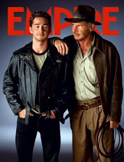
This is a Empire magazine cover taken from the 2009 edition. It is my job to pick out the typical conventions of these film magazines which we can then use in order to make a realistic movie magazine front cover ourselves.
- Empire can be seen clearly at the top of the page in large red letters, it is their logo and the characters overlap the writing this does not matter because Empire magazine is the worlds leading magazine and people know the logo well.
- The two actors are dressed as their character as it is Indiana Jones just from the whip and the hat he is instantly recognisable to the readers eye.
- They are not looking at the camera but at eachother which shows that there is going to be some sort of relationship formed here.
- The back ground is very minimalistic in a sense that it was proberly shot on a green screen and then through photoshop a gun metal grey/black background would have been added in.
- It is a convention that the background is blank because then your focus is on the characters or the actors on the front cover, also the fact the this would have been taken in pre-production means there is no official background yet because filming might not have started.
How is this a useful example?
Well i think by looking at many magazine cover the majority of them are include the character in their costumes because unless the actor is very well known legendary, the viewer is not going to know who it is in the first palce. With our film obviously not being well known we need to use the character in order to sell the magazine and the film otherwise it is just going to be a random person in normal clotheing doing a photo shoot.
Also a character is alot more appealing to the normal eye rather than just a guy in a suit, especially is the costume is cool such as Indiana Jones or Batman. So my conclusion is this is the road we will go down, there will be a simple back ground with just the character and perhaps a prop like a guitar.
 Empire is the world's leading film magazine and proved easy to find some influential front covers. I liked how the magazine always places the text behind an object/character, so I used the same style in our own magazine front cover. At first I had trouble doing this, as I wasn't too sure how to fulfill this effect. I simply looked on Bing.com and found a tutorial. I used Adobe Photoshop CS3 to complete this action, as it's a programme I use in other subjects and for personal use.
  I used this front cover to look at the wording of advertisement. For example when Empire states "First Look", I also wanted to add this exclusive peak to advertise. On our final draft of the front cover, I used 'World Exclusive' and 'First look at the wanderer', to give the same the effect but creating a subheading of world exclusive. I made subheadings like this to keep the arrangement of the poster neat, keeping to that old fashioned western theme.
  I also noticed that Empire have their own organisation of headings, always using 'Plus!' as a subheading for inside contents. I thought this was an effective way of targeting an audience, as it allows people to read the front cover and get an insight to what it contains. On our poster I made the sub heading 'More' to keep to our formal appearance I didn't use an exclamation mark.
 Another well known film magazine is Total Film, who review trailers, films and film news. They're titling is often large, and make their heading cover a quarter of the page. Whilst creating the front cover, I noticed 'Total Film' use the same fonts in their layout or the same colour scheme. After learning this I thought the front cover would be neater if I kept the font the same on the cover, but I did vary this when adding film names. I felt adding the film names in a different font adds their own advertising to the front cover.


