Friday 23 September 2011

Magazine Cover conventions


After looking at several magazine conventions I decided to create this visual template to show how a magazine front cover is able to successful spread their information across the page and capture the attention of any passing consumer. (Please click on the image above) I have created the template in this fashion because humans read from left to right that is why the magazines main information is situated on the left hand side because it is going to be the first thing people are going to read. Also the magazine front cover needs to have is own unique personality that way it can be easily distinguished if it is surrounded by other magazines in a newsagents.

DVD Front Cover

Here is the front cover of our DVD case which shows a bottle of whiskey and John Walters looking up into the sky thinking about his problems. The light also is suggesting a resurrection hence the use the title of the movie. The conventions followed include the tagline at the bottom and the names of the people that are in the film at the top, again it is minimalistic and very gloomey a look we purposly created.

John Walters DVD

This is the back of a DVD cover. As you can see it has some clear conventions such as magazine and newspaper ratings also views from critics. I like the simple plain colour of it too. The costume and props used are minimalistic but it is clear this film is about a musician.

lesson work since summer

Since the Summer break we have been working hard in concluding our production, which has included editing and other range of work such as final production pieces to upload to the blog such as poster analysis, teaser trailer analysis and magazine front covers to analysis.
We are stuggling to find the soundtrack to the johnny cash song 'hurt', if we are unable to pursue this work we will then have to turn to the song 'beast in me'.
We have started editing, but it is a slow progress, as we would like to take our time to create a good piece of successful work. The reason why the editing process is coming along slowly is because to create a successful piece of work you must take your time in order for it to work.
We have set ourselves some deadlines to finish our final piece of work in order to make everyone work just as hard and completely finish our whole production, and hopefully it will be a huge success.

Wednesday 21 September 2011

Film Magazine Front Cover

This is a cover from a 2010 edition. Though is is similar to the Indiana Jones magazine cover it is different in a sense that rather than the characters being on the front cover it is instead the actors. Every now and again these covers are produced because the actors involved in an upcomming movie are being interviewed. Personally i like it when empire do this becasue you get to see the person behind the famous character/persona and it is a route i would not mind going down myself, the only problem we are faced with is that obviously our film is not well known so the picture on the front of the magazine cover must be our character. The conventions of this type of magazine cover are :


  • Often the actors are dressed smart or casual. This indicates that really behind their famous life style they are still normal people which everyday people can relate with.
  • It strips down the actor purposely to their original state (they are not in costume) so a reader is priviledge to go into their everyday life and not just see a whacky or famous character.
  • Similar to many back ground colours there is a grey with a hint of black. A lot like fog. This interview and the picture would have been taken in either pre-production or during filming so the back ground remains plain.
  • The actors are staring directly at the camera and if you look at their feet it seems like they are walking towards the camera suggesting because this is a sequal the journey continues.
  • Most of the time when the character has a photoshoot and is put on the magazine cover they look away almost looking in the distance and appear smouldering. With an actor it is differant they look at the camera and then when the picture is put onto the cover it is asthough they are looking at the viewer which suggests that the actor is letting you into their off sreen life.

How is this example useful?

This magazine cover helps because once again it shows how important the title of a magazine is to the owner & has made me think that we as a group need to come up with a good magazine title of our own. I like the idea of just showing the main actor on the cover because it seems asthough you are let into the inner workings of an actor but as i said in this case we are unfortunatly not famous already so our character will have to be the strong center image for this magazine front cover.

Research of Magazine Front Cover Empire

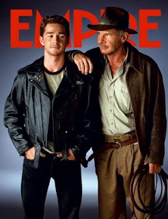
This is a Empire magazine cover taken from the 2009 edition. It is my job to pick out the typical conventions of these film magazines which we can then use in order to make a realistic movie magazine front cover ourselves.

  • Empire can be seen clearly at the top of the page in large red letters, it is their logo and the characters overlap the writing this does not matter because Empire magazine is the worlds leading magazine and people know the logo well.
  • The two actors are dressed as their character as it is Indiana Jones just from the whip and the hat he is instantly recognisable to the readers eye.
  • They are not looking at the camera but at eachother which shows that there is going to be some sort of relationship formed here.
  • The back ground is very minimalistic in a sense that it was proberly shot on a green screen and then through photoshop a gun metal grey/black background would have been added in.
  • It is a convention that the background is blank because then your focus is on the characters or the actors on the front cover, also the fact the this would have been taken in pre-production means there is no official background yet because filming might not have started.

How is this a useful example?

Well i think by looking at many magazine cover the majority of them are include the character in their costumes because unless the actor is very well known legendary, the viewer is not going to know who it is in the first palce. With our film obviously not being well known we need to use the character in order to sell the magazine and the film otherwise it is just going to be a random person in normal clotheing doing a photo shoot.

Also a character is alot more appealing to the normal eye rather than just a guy in a suit, especially is the costume is cool such as Indiana Jones or Batman. So my conclusion is this is the road we will go down, there will be a simple back ground with just the character and perhaps a prop like a guitar.

Monday 19 September 2011

I'm Not There Trailer


This film is like many other teaser trailers, in the way it is constructed and produced. in the opening credits the audience can see the american association of motion pictures as well as the production company 'The Weinstein Company', once the beginning credits are over, the trailer then begins.
the opening of the teaser introduces the main character or Bob Dylan, on stage when 'all I can do is be me, whoever that is'. This gives the audience a small taster of what the audience expect to see, once the words fade out, suddenly 6 different characters pop up, showing maybe how the storyline shows different points of view and not just from one specific persona.
quick small shots show the trailer which are followed by graphics showing the actors names, this will engage the audience if they have a favoured actor who they may wish to go and see in a specific role like 'i'm not there'.
The trialer keeps progressing and then in big, bold writing the words 'Are all BOB DYLAN' this portrays how the film is coming from the same person 'bob dylan' yet there are 6 different actors portraying one major icon.
We wanted to portray a character a lot like Bob Dylan who has had a torrid time with life, we created a character who is torn form the rest, and has a major addiction with drink and drugs, and we believed Bob Dylan was an immense character to study.

Crazy Heart - Official Trailer


This teaser trailer for the film 'Crazy Heart' is consturcted the same way as many other teasers. This includes the mention of the 'Motion Picture Association of America' which is then quickly followed by the production company 'Fox Searchlight Pictures'. As soon as the logo is shown the music for the trailer begins immediatly and sets the tone for the entire trailer which is quite slow and relaxed.

The trailer quickly sets up the main characters by having them introduce themselves 'Jean Craddock' and 'Bad Blake' this is so that the viewer starts to feel some connection with them beacsue otherwise they wouldn't relate to them if they remained unnamed. This is then quickly followed by graphics repeating the production companys name and naming the main actors and their achievements e.g. '4 Time Academy Award Nominee Jeff Bridges' this is to try and engage the viewer and make them want to see the film if they are a fan of Jeff Bridges who is an amazing actor.

The trailer continues with several shots revealing the progression of Bad Blakes life as he experiences the highs and lows with the people he encounters. Also it is quite clear to the viewer that his appearance changes because during the trailer they see him as a drunk with nothing and then they see him as a respectable man loving life this is to show that the film follows his life.

This is what we want to do with our trailer because we want to show that our charcter of John Walters goes through many hardships in his life and that the film will document how he has or hasn't coped with all that has happened to him.

Friday 16 September 2011

Walk the Line Trailer


The teaser trailer from Walk the Line conveys many of the typical conventions we are looking to use in our own teaser for example:

Motion picture association always appears before the trailers footage starts to play.
Production logo and company name appears shortly after the motion picture association dissapears.
For this trailer graphics are used to explain some of plot line such as "Rock & Roll hall of fame" appears telling the veiwer that this will be a film about some sort of musician.
After graphics a short monolouge is said by a random character which puts the trailer into perspective that this is a struggling muscian trying to break the industry by attempting to get a record deal.

Quick editing is used such as short cuts of footage the main character performing (happy) and as the shots progress his nature seems to quickly deteriorate. Much sweating comes with this suggesting possible durg use within the film. It would seem the main character gains fame and with this has the attitude of a bachelor sleeping with many different women behind his wifes back.

Fame seems to go to his head immediatly and he soon has a come down which brings his nick-name "The Man In Black" which is a pictation of who he becomes inside a dark man, fuelled by sorrow and driven by rage.

Thursday 15 September 2011

Influential Films


Crazy heart is an american musical-drama film which is based on the life of a down and out conrty western singer (otis Blake) who tries to turn his life around when he meets a beautiful young journalist (Jean Craddock).
Blake is the main persona in the film as he is the main character on the poster.his distort apperance shows how his life may have panned out not quite planned, with his rugged look on the poster, as he looks scruffy and disorderly. Yet, once Blake meets this beautiful brunette, he decides to change his washed up appearance, and he is pushed to team up with a succesful and professional relationship with Tommy Sweet, a top country star. This may also be shown on the poster as he has a slight grin on his face, proving how he has turned a corner. With his once disgraced self, this could be emphasised by the tagline "The harder the life, The sweeter the song". Which may also show how Otis 'bad' Blake has changed is genral appearance and attitude in life.

Monday 12 September 2011

Influential Films 12/09/11

In today's lesson we were analysising and studying two different types of trailers, such as teaser trailer's and theatrical traielrs. Once the class had finished studying these traielr's our group went off and identified 5 different trailers, these were:
Walk The Line
Crazy Heart
I'm Not There
Batman- The Dark Knight
The Girl With The Dragon Tattoo.
We studied these carefully and identified specific analytical conventions which were key for our own teaser trailer, which we are hopeful of editing very soon.

Friday 9 September 2011

To Do List:

  • Analysis of the teaser trailer differences between extended trailers and teasers
  • Analysis of the film magazine front cover
  • Analysis of the teaser poster
  • All to be done in four weeks. 7TH of October everything is done
  • Film edited within next week