
Saturday, 12 May 2012

Thursday, 10 May 2012
Wednesday, 9 May 2012

Tuesday, 8 May 2012
Film Teaser Trailer Ideas
7th March 2011:
 Before starting our film trailer we had brainstormed ideas immediately after creating our opening scene in AS level.

Use of Synergy
During the process of creating our film trailer, we looked to get feedback from our audience. We allowed classmates to review the film and give us criticism that would help us improve. One member of the group noted the feedback so we could look back at what was said.
We used social networking sites to get a wider range of criticism from a range of ages, including family members, friends and friends' of friends. Facebook and Youtube worked most effectively, as Facebook users could instantly watch and share our film trailer, similarly with Youtube sharing and commenting.
To edit our main task we used Apple's Final Cut Express Pro. This is an advanced video editing software, created by Apple Inc. This was a new video editing software for us to use, as we had previously used Adobe Premiere Pro. Although Premiere Pro doesn't edit HD video, so we used this as an alternative. It took some practise and tutorials to learn how to master Final Express Pro, and stylise parts of our film trailer such as the title's font and transitions.

To create the ancillary tasks I used Adobe Photoshop, as I am more familiar with that software. Adobe Photoshop is a graphics editing software, that helped me adapt images with text/font and different lighting. Also I used it to manipulate images, for example removing John Walters from an image and extended the shadow to create the poster.
Shown below is the final poster and its original image. I used Photoshop to create the poster, enhancing the brightness, contrast and shadows of the image.


We used social networking sites to get a wider range of criticism from a range of ages, including family members, friends and friends' of friends. Facebook and Youtube worked most effectively, as Facebook users could instantly watch and share our film trailer, similarly with Youtube sharing and commenting.
To edit our main task we used Apple's Final Cut Express Pro. This is an advanced video editing software, created by Apple Inc. This was a new video editing software for us to use, as we had previously used Adobe Premiere Pro. Although Premiere Pro doesn't edit HD video, so we used this as an alternative. It took some practise and tutorials to learn how to master Final Express Pro, and stylise parts of our film trailer such as the title's font and transitions.
To create the ancillary tasks I used Adobe Photoshop, as I am more familiar with that software. Adobe Photoshop is a graphics editing software, that helped me adapt images with text/font and different lighting. Also I used it to manipulate images, for example removing John Walters from an image and extended the shadow to create the poster.
Shown below is the final poster and its original image. I used Photoshop to create the poster, enhancing the brightness, contrast and shadows of the image.


Friday, 27 April 2012
Targetting Our Audience
As we already had our influential films in place from our last project we started to research into how these film target an audience. The chosen films were: Walk The Line (2005), Crazy Heart (2009) and I'm Not There (2007).


Crazy Heart and I'm Not There are two films with a rated 15 certificate, because they contain scenes with more explicit objects or actions such as drugs, alcohol and nudity. Walk The Line is more discreet about showing these sensitive subjects, by showing them less frequent. In our film, the idea was to create an emotional and serious view on the affects of drugs and alcohol. To create a more indepth view of these substances we were liable to use graphic scenes that may contain violence and drug taking. This came into terms when we chose our target audience because we certainly did not want to explore this subject to younger spectators.
 Furthermore we felt as though this film would be targetted for a more mature audience, as children may not understand the message put across from the films and what the film shows. Similarly to the film Crazy Heart, our intentions were to show a dysfunctional life of the protagonist character (John Walters). We thought that someone may relate to this lifestyle by struggling with obstacles in the way of happiness.


Crazy Heart and I'm Not There are two films with a rated 15 certificate, because they contain scenes with more explicit objects or actions such as drugs, alcohol and nudity. Walk The Line is more discreet about showing these sensitive subjects, by showing them less frequent. In our film, the idea was to create an emotional and serious view on the affects of drugs and alcohol. To create a more indepth view of these substances we were liable to use graphic scenes that may contain violence and drug taking. This came into terms when we chose our target audience because we certainly did not want to explore this subject to younger spectators.
Monday, 23 April 2012
Production: Location

During the February half term we were lucky enough to go on a school trip to New York City. While there we were adamant that we would get a shot of the Statute of liberty, the symbol of freedom, for our trailer to symbolise a gleam of redemption in John Walters life. Originally we were meant to get on a ferry and travel all the way to Ellis island, where the statue is, that way we could have had very dynamic shots of our actor up close and personal with the statue. but we missed our ferry by a matter of minutes. So instead we went on the Staten Island ferry which took us all the way around Ellis island. This actually worked to our advantage because instead of just fitting a small section of the statue into the frame I was able to get the statue from head to toe making it instantly recognisable to the audience. In hindsight I much prefer the shot we have now because it allows the beauty and scale of the statue to be viewed all at once which leaves a greater impact on the audience as they acknowledge the symbolic message of hope.
Production: Glass Table Shot


One of the shots filmed for our trailer was a panning shot of the character John Walters drinking a glass of whiskey through a glass table. We achieved this shot by using a pane of glass, that i had previously purchased for a past production, as the glass table. We elevated the glass to an appropriate height to allow me, the cameraman, to slide comfortable underneath with enough room for movement and for my HD camera. Two Chairs and a stack of books were used to set up the pane of glass this allowed the 'glass table' to be very easy to set up and clear away afterwards.
There was a carfeul amount of consideration that went into what props should be placed on the table and how they would be laid out. the props used were medicine bottle, fake tablets, a whiskey glass, apple juice, cigarettes, ashtray, US dollar and flour (cocaine). We chose these items because we intended to make the characters addiction and weakness known to the audience. This makes them feel sympathy towards John Walters as they see he is a damaged individual who is poisoning his life and harming his chances of ever redeeming himself.
the original idea was to have the props spread right across the table by due to the limited amount of space below the glass the only motion i was capable of was an up and down motion meaning we could achieve a pan shot if all the props were placed closer together.
I used the focus on my camera to slightly blur the props in the foreground this strengthend the image of John Walters drinking his whiskey in the background. We made this creative decision because by blurring the foreground we didn't allow the audience to dwell on all the sinful things John walters is doing in his life. Instead by strengthening the image of him in the background it reminded the audience that he is only human and that he makes mistakes.
The location for the shot was in my kitchen. We chose this location because there are fluorescent lights situated in the ceiling which lit the scene perfectly allowing all the prop details to be illuminated. it also gave us a lot of room to set up the glasss table without completely rearranging the room.
Thursday, 29 March 2012
Research Into Front Covers
 Empire is the world's leading film magazine and proved easy to find some influential front covers. I liked how the magazine always places the text behind an object/character, so I used the same style in our own magazine front cover. At first I had trouble doing this, as I wasn't too sure how to fulfill this effect. I simply looked on Bing.com and found a tutorial. I used Adobe Photoshop CS3 to complete this action, as it's a programme I use in other subjects and for personal use.
  I used this front cover to look at the wording of advertisement. For example when Empire states "First Look", I also wanted to add this exclusive peak to advertise. On our final draft of the front cover, I used 'World Exclusive' and 'First look at the wanderer', to give the same the effect but creating a subheading of world exclusive. I made subheadings like this to keep the arrangement of the poster neat, keeping to that old fashioned western theme.
  I also noticed that Empire have their own organisation of headings, always using 'Plus!' as a subheading for inside contents. I thought this was an effective way of targeting an audience, as it allows people to read the front cover and get an insight to what it contains. On our poster I made the sub heading 'More' to keep to our formal appearance I didn't use an exclamation mark.
 Another well known film magazine is Total Film, who review trailers, films and film news. They're titling is often large, and make their heading cover a quarter of the page. Whilst creating the front cover, I noticed 'Total Film' use the same fonts in their layout or the same colour scheme. After learning this I thought the front cover would be neater if I kept the font the same on the cover, but I did vary this when adding film names. I felt adding the film names in a different font adds their own advertising to the front cover.
 Monday, 26 March 2012


Sunday, 4 March 2012
Friday, 10 February 2012
Post Production: Draft Two
After looking through Internet images of any influential poster ideas, I managed to collect a few conventions of a poster. The films I looked at were True Grit (2010), Casino Royale (2006), Inglorious Basterds (2009) and The Dark Knight (2008).


I used these posters to get an idea of how a teaser poster looks in terms of, layout, font, size of text, design and colour. Each poster individually helped me create the teaser poster with the suitable conventions of a teaser in place.
In terms of development we worked as a team to portray a poster as effective as possible with the equipment we had. From the draft one to our final draft, there are noticeable improvements to the quality of work.


As we tried different images, we realised it is crucial to maintain the idea of being a 'teaser'. Therefore we needed to make sure that little information was given away and keep the design of the poster neat. After looking through more posters we had an attraction to making the image of John Walters a shadow. As an editor this task was challenging as I had to cut out John Walters character and expose the shadow clearly. To do this I masked off section of the characters body, and had erased it. This appeared rigid and messy, so I used a range of tools to blur, burn and smudge areas. These tools blended pixels together, therefore reducing the rigid appearance and creating a bold outline. In addition to this I manipulated the image itself, adding darkness by adjusting the contrast and brightness.
Magazine Front Cover Analysis

We wanted the title to be big and bold, as this would stand out for our target readers., also with the bold white writing on a dark background, it stood out even more.
With the title, we decided to use a typical western font, as this was the correct decision considering our film was within the western genre, also knowing that the title is exactly by a picture of the main character enables the reader to understand what the magazine cover is about. We had some small issues with jimmy’s head, as at first we could not put it over the title until we cropped it.
The use of different films congealed on a certain side of the cover is a typical magazine convention, and engages a reader to buy the magazine and read on. The use of different fonts for the films was to show how all the films have an individual identity.
The use of the sub-heading ‘world exclusive’ is another typical magazine convention, and we used this heading, as it was used often on many professional magazine covers.
Once again the use of the sub-headings are typical magazine conventions, and give the reader a slight insight into what they expect to see within the magazine.
With the picture being in the middle of the page, it enabled us to consider over conventions such as the headings, title, barcodes and the use of font.
The use of the barcode, is a usual convention for any magazine, and we after looking at many different magazine front covers, the majority of the barcodes were in the bottom right hand corner of the page.
Post Production: Draft One
To create the poster I used the graphic editing software Adobe Photoshop CS3. As the CS3 version isn't the newest product Adobe had made, it was easier to get different tutorials because of how long it has been in use. Also I found it easier to work with because I work with Adobe Photoshop CS3 in other subjects.
 Firstly I emphasised the influence of black within the photo,creating an ominous presence. I achieved this by 'masking' the areas behind the character John Walters, then filling the area I had selected with black. I also added the title of the film, placing it on the black in a white font so it stood out. I carried on using the same font, used throughout the film. Once I had added the title, I placed the logo that represents our production team and then other logos that existed within our film.
 To make the logos appear more effective I had to erase all the white areas around the image. Furthermore I decided to retouch all the rigid areas around the 'Four Horsemen' logo, by zooming in on the photo showing all the uneven pixelated areas. I simply erased the uneven edges, using the 'eraser tool'. It was vital I organised my work accordingly, placing different steps into 'layers'. Layers are in Adobe Photoshop to hold part of an image or a whole image, create exacting adjustments to our images, combine multiple images, or create new images. They are effects or images that have been placed into the programme by the editor, which then can be organised into groups or named.
Wednesday, 8 February 2012
John Walters Analytical Poster Review

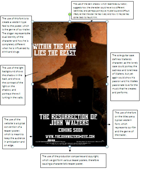
For our poster, which is in the process of being edited, we have a shadowed figure in the background, which may show the audience that the main character is a strange yet mysterious person. This may also show the possibility of a split personality problem, and how he has not got a clear idea for himself.
The use of light on the back wall, suggests how Walters may be moving forwards into the light and into a brighter future, especially suggesting the way that his shadow is facing. It may also suggest the use of a split personality once again with the use of the light with him dark, perhaps suggesting how he is in a different mindset.
The use of the lonely guitar case resembles Walters past, as he has been very troubled, and has gone through a rough patch in his career. The Guitar case also represents strength to the audience, as it stands there alone, it can relate to Walters, how he has to battle his own wars alone with alcohol and drug abuse without any help.
The use of font for our poster is Vanilla White; we chose this because it gave the best effect of a western genre. The wording is very western like, but also gives a slight hint of the godfather, with the lines blurring off to the side.
The use of the website on our poster is to give the idea of a real poster convention; therefore like the posters we studied such as Inception, they all had links to their websites at the bottom of the poster.
The use of production companies at the bottom of the page is another typical convention of film posters, as this is shown with the posters in Gran Torino and Inception. It sometimes has links to the production company’s websites, which can give more information into the existing film.
Monday, 6 February 2012
6th February 2012
Final production work is eventually being tied up and completed now, and should be completed shortly. The poster has been evaluated and completed, and we are just waiting for other members of the group to upload them. Our evaluation is also near conclusion; the only thing we are waiting for is the upload of the final pictures to the evaluation.
Our magazine cover is also near to being finished, with just a few, small adjustments being needed to try and perfect our cover, we were having obvious problems with the titles and sub-headings along the side of the front cover. We had problems with the 100 greatest performances, which seemed strange for a magazine cover. For the fonts, we had numerous different fonts for the magazine cover, therefore causing a lack of continuity running through our front cover.
Our magazine cover is also near to being finished, with just a few, small adjustments being needed to try and perfect our cover, we were having obvious problems with the titles and sub-headings along the side of the front cover. We had problems with the 100 greatest performances, which seemed strange for a magazine cover. For the fonts, we had numerous different fonts for the magazine cover, therefore causing a lack of continuity running through our front cover.
Tuesday, 24 January 2012
Feedback: Ancillary Task Poster
I have been working on our film's teaser poster and need feedback but mainly to try and decide what font would be best.
Here are some images below...


Here are some images below...


Monday, 9 January 2012
Feedback: The Magazine Cover
The magazine cover was interesting and gave us many responses which would allow us to further our progress such as:
The font of the magazine could be smaller and clearer to see
Some of the titles on the sides of the cover could be clearer, and more thought of
The image is good, and gives a clear picture of the film
The use of lighting is good showing a light side and a dark side of the film
The barcode at the bottom of the page could be turned flat
The price of the magazine is too big for the proportion of the magazine
Good title very big and bold, makes it stand out to the reader
Feedback: Teaser Poster
The audience feedback was really productive for us as a group; we got feedback on both our poster and magazine.
Poster:
Font is too big for the proportion of the poster
The website should be changed as it is unrealistic and usually has movie or film added at the end of the URL
Like the image as it stands out
The title of the film ‘The Resurrection of John Walters’ should be lowered as this will fit in with the shadow
Like the use of the production companies at the bottom, looks very professional
Good use of props and clothing
Good use of lighting
Tagline could be shorter
Subscribe to:
Comments (Atom)