Labels
- Ancillary Magazine Front Cover (8)
- Ancillary Task Poster (15)
- David Clarke (16)
- Editing (13)
- Evaluation (4)
- Jamie Ward (20)
- Jimmy Gore (22)
- Liam Fitzpatrick (10)
- Main Task (2)
- Planning (19)
- Reel Magazine Front Cover (1)
- Research (All) (16)
- Research Into Audience (7)
- Research Into Front Covers (6)
- Research Into Teaser Posters (2)
- Research into Teaser Trailers (2)
- Synergy (3)
- The Resurrection Of John Walters Teaser Poster (1)
- Time Management (15)
Wednesday, 14 December 2011
Poster Analysis- John Walters
We used a light background on Jimmy’s front side to firstly show him in colour, but secondly the use of the black shadow behind him to show how his character is somewhat confused, and shows a sense of insecurity and uncertainty.
Here we have the use of writing in our title and the tagline which stands out as it is white on black. We used the font Engravers MT as it gave us the impression of a western film genre, and also gave us our own feel. As we created this poster ourselves.
Here we have our actor, Jimmy, who is posing as a washed up country singer, who is slowly regaining his stardom, to create this we used the correct costume such as shirt and tie, to portray a singer who is slowly coming back. We also used a guitar case, to make the storyline clearer for our audience. The use of lighting was also used to show how our character has turned away from his past, and is now living a new life.
The use of lighting was specifically used to show how our character has changed his ways, and is now living a new life, the lighting effect was also brilliant as it created a shadow effect behind Jimmy
The use of titles was included as this is one of our own production companies in which we created, specifically for the resurrection of John Walters. We also made our own website and pictures companies.
Wednesday, 7 December 2011
Wednesday 7th December
In today’s lesson we have finished the editing of our evaluation, and are now looking for specific pictures to add into our final evaluation, we have edited all of our evaluation including the sound, and we are now biding our time, looking for pictures to include into our evaluation. As the producer I am closely watching over the process of the evaluation, and watching closely at the editing.
Wednesday 23rd November
Today we have started and completed our evaluations, which included talking about production work, editing, and research and planning. All these areas were key as this was essential for us creating a professional and successful looking trailer, all of which were included in our evaluation. As our entire group members had different roles, so therefore we had to talk about our specific roles, and how we helped the group to create a successful trailer.
Monday 21st November
We have finally overcome our problems with the editing of our poster and magazine cover. We used a specific technique on Adobe Photoshop called masking, which allowed us to go around Jimmy’s head, and put the title behind his head, this was a great achievement for us, as we had never used masking in any editing process before. Our poster was also a success as we used a technique which also allowed us to mask around jimmy’s body and therefore, out a jet black background, showing a mysterious shadow lingering over jimmy, as stated in previous posts, this is because we wanted to create an unclear character.
Wednesday 9th November
Both the poster and magazine covers have hit a small stumbling block as the editing process on both have become very tricky to understand and complete, therefore, causing our editors a slight problem in completing them. We are having problems with Adobe Photoshop as our Title is going in front of our lead actors head, therefore making the poster look unrealistic and scruffy. We are also having a problem with the background, as we cannot colour around our character without colour going over him, we are working together in trying to solve these minor issues.
Wednesday 2nd November
Now all of our production work was complete we then had to move on to the editing of our poster and magazine cover. This proved difficult for us as we had hundreds of photos to choose from. Through the choosing process, we wanted to create something that would stand out, but also represent what our character was about, as our character comes across as a drunken mess who is unclear in what way his life is heading. So we thought having a dark background on one side, and a light shining on the other, would represent a clear and maybe mistaken character, and how his life is slowly transforming.
With our magazine cover we wanted to create something that was eye-catching, and would intrigue the reader, we included added incentives, such as other films we had thought of, and put them on our front cover, for this we used different fonts to show how they all have their own styles and different representations. Then we thought that this would be a continuity error for our magazine and make it stand out for the wrong reasons.
Our magazine and poster is coming along nicely, we now just have to add the finishing touches, and then we will be completely finished.
Monday, 10 October 2011
Post Production
This image was taken infront of a green screen, to make the editing process easier. I experimented with this picture, creating multiple examples of review ideas.
With this image I had the idea to manipulate the shadow and tone of the image. I converted the colour tone to sepia, portraying an 'old-fashioned' effect. Furthermore the sepia tone distorted the quality of the image, emphasising the old style effect I was trying to achieve.
The main issue with this image was the photo wasn't taken on a blank background. Therefore editing was difficult when selecting and manipulating the image. I had to black out the entire background and remaster the position of objects.
This was our final chosen image to use for our magazine front cover. We decided as a group this was the most effective and neat image for a magazine cover. I managed to manipulate this photo, by adjusting the brightness, contrast and tone of the image. Furthermore I added the title of the cover and placed it behind the character, similar to the 'Empire' magazine.
Another Edited rough copy of a movie poster.
We think this looks like more of an album cover rather than a teaser poster. Still i think it is a cool concept with the tag line which is a convention for the movie poster. And "COMING SOON" is also a convention that we stuck too and used. The logos at the bottom are always used for movie posters aswell. Again this is like the Clint Eastwood poster we posted previous. It also has a great sixties feel to it with the Ray Ban sun glasses. Again this is a rough draft and is not our offical movie teaser poster.
Production: Draft Idea
Here is a very roughly edited teaser poster that was edited from an old photo we found in our files on a memory stick. This is not our official movie teaser poster but just a rough draft we liked. It follows the conventions of a Johnny Cash album cover but not the same size. As you can see it is very minimalistic in terms of text only the title can be seen & there is no tagline.
It is supposed to look like John Walters the character is standing on stage in all his glory with his guitar on his back in an iconic Johnny Cash like pose. The spotlight is focused on the character and the text is very minimalistic showing classic conventions of a movie poster.
Photo shoot. Wednesday the 5th of October.
This is an example of one of the photos taken on Wednesday. The intention of these photos was to use them for our magazine front cover. We thought by using this back ground we could straight away elminate creating a back ground on photoshop. Simply because the back ground here is perfect its dingy and minimalistic. I also feel it looks alot like an Empire Magazine front cover because the photos are usually taken way before the production has even started. Almost like the photo is taken especially for the magazine front cover in some sort of contract.
As you can see we have decided to have the character in costume rather than the main actor in a suit. We decided to do this because we wanted to stick to the conventions of many other movie magazine covers. We also decided that it would be significant having a large shadow cast on the wall behind the character as it shows a potentional split-personality problem. Clearly this is no edited yet but we are currently working on our official magazine front cover right now.
Wednesday, 5 October 2011
production teaser poster 5/10/11
In today's lesson we decided to shoot our final ideas for our teaser poster. We decided to shoot these photos in one of the school's drama studios, our initial thought to shoot there was because it was being refurbished, and gave that typical run-down look, which is ideal for our photos and our genre. We also borrowed the photography lights form the art block, this gave us the opportunity to change the focus of the lights, therefore we could create many different shots and angles of the light for our actor. We also used different props such as clothing, a guitar and a case for the guitar, all of these were used to portray a western genre.
We had to use an extension lead for the lights, as well as having a huge piece of scaffolding right next to the lights, which did obstruct us at times, although I believe we made it work to the best of our ability.
Monday, 3 October 2011
Similar poster - Gran Torino
As you can see we based our simple draft poster which you can see further down on the blog on Clint Eastwood's brilliant 2009 film poster for "GRAN TORINO". The conventions for a poster like this are:
- "COMING SOON" at the bottom of the page shows it is still a while until it is released but builds excitment.
- "CLINT EASTWOOD" at the top before the title showing off that the film has a big named Hollywood actor in it which of course gets the lookers attention.
- The titles in a large golden font which is significant consdering everything else is dark and dingy in terms of colour.
- The list of actors, producers, all important crew members and the directors name can be seen under the title but it is always very small writing and faint because they do not want the small print to attract the lookers away from the star and the title. Also at the bottom the Warner Brothers logo is showing which is standard for a film poster shows the film companies involvement.
- Finally the actual picture is a side profile shot almost like a silhouette of a warn old face looking in the distance which create a sense of enigma "what is this about?".
I like this poster because it creates wonder and mystery the lighting is also very cool. We will create a similar look withour film poster.
Ancillary: Images For Poster and Front Cover
This is the first time we have worked with a green screen in terms of taking pictures I am still yet to make any sort of film footage using one though I hope to do that in the future. As you can see from this pictures we got some large bright lights from the photography department in our school. I feel those lights improved the pictures also it helped that we were using a DSLR HD camera. When using this specialist camera we found looking back at the images that we were impressed with how clear and crisp the photos were.
The editing process becomes a lot easier when using a plain or green background because it is very simple now to cut objects and people out of the photo. Using the green screen is also fun because there are a lot of backgrounds, fonts, objects and colours you can use with the editing programme.
Teaser Poster
This is not a final copy of our film teaser poster but it is a work in progress and i just wanted to show the sort of look we are going for. As you can see it is very minimalistic in terms of colour which reflects the tone and mood of the film. I like this close up side profile shot because it's almost like there is something different on the other side of his face which then leads onto viral marking and enigmas.
There is no font of writing on it yet. Obviously if this was our poster people would be asking what it is about because all it seems to be is a shot of a man with glasses on. Once a suitable tagline is fitted onto the poster such as "THE HARDER THE LIFE, THE SWEETER THE SONG" it will become a lot clearer in terms of what genre this film fits into. There is a certain class to this photo though black and white i feel pays respects to the old school film making methods. We are currently in the process on editing a final poster but we are thinking of making several ones as we want to explore what we can do with photoshop and green screened picture taking.
Friday, 23 September 2011
Magazine Cover conventions
After looking at several magazine conventions I decided to create this visual template to show how a magazine front cover is able to successful spread their information across the page and capture the attention of any passing consumer. (Please click on the image above) I have created the template in this fashion because humans read from left to right that is why the magazines main information is situated on the left hand side because it is going to be the first thing people are going to read. Also the magazine front cover needs to have is own unique personality that way it can be easily distinguished if it is surrounded by other magazines in a newsagents.
DVD Front Cover
Here is the front cover of our DVD case which shows a bottle of whiskey and John Walters looking up into the sky thinking about his problems. The light also is suggesting a resurrection hence the use the title of the movie. The conventions followed include the tagline at the bottom and the names of the people that are in the film at the top, again it is minimalistic and very gloomey a look we purposly created.
John Walters DVD
lesson work since summer
Since the Summer break we have been working hard in concluding our production, which has included editing and other range of work such as final production pieces to upload to the blog such as poster analysis, teaser trailer analysis and magazine front covers to analysis.
We are stuggling to find the soundtrack to the johnny cash song 'hurt', if we are unable to pursue this work we will then have to turn to the song 'beast in me'.
We have started editing, but it is a slow progress, as we would like to take our time to create a good piece of successful work. The reason why the editing process is coming along slowly is because to create a successful piece of work you must take your time in order for it to work.
We have set ourselves some deadlines to finish our final piece of work in order to make everyone work just as hard and completely finish our whole production, and hopefully it will be a huge success.
Wednesday, 21 September 2011
Film Magazine Front Cover
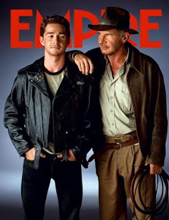
This is a cover from a 2010 edition. Though is is similar to the Indiana Jones magazine cover it is different in a sense that rather than the characters being on the front cover it is instead the actors. Every now and again these covers are produced because the actors involved in an upcomming movie are being interviewed. Personally i like it when empire do this becasue you get to see the person behind the famous character/persona and it is a route i would not mind going down myself, the only problem we are faced with is that obviously our film is not well known so the picture on the front of the magazine cover must be our character. The conventions of this type of magazine cover are :
How is this example useful?
This magazine cover helps because once again it shows how important the title of a magazine is to the owner & has made me think that we as a group need to come up with a good magazine title of our own. I like the idea of just showing the main actor on the cover because it seems asthough you are let into the inner workings of an actor but as i said in this case we are unfortunatly not famous already so our character will have to be the strong center image for this magazine front cover.
- Often the actors are dressed smart or casual. This indicates that really behind their famous life style they are still normal people which everyday people can relate with.
- It strips down the actor purposely to their original state (they are not in costume) so a reader is priviledge to go into their everyday life and not just see a whacky or famous character.
- Similar to many back ground colours there is a grey with a hint of black. A lot like fog. This interview and the picture would have been taken in either pre-production or during filming so the back ground remains plain.
- The actors are staring directly at the camera and if you look at their feet it seems like they are walking towards the camera suggesting because this is a sequal the journey continues.
- Most of the time when the character has a photoshoot and is put on the magazine cover they look away almost looking in the distance and appear smouldering. With an actor it is differant they look at the camera and then when the picture is put onto the cover it is asthough they are looking at the viewer which suggests that the actor is letting you into their off sreen life.
How is this example useful?
This magazine cover helps because once again it shows how important the title of a magazine is to the owner & has made me think that we as a group need to come up with a good magazine title of our own. I like the idea of just showing the main actor on the cover because it seems asthough you are let into the inner workings of an actor but as i said in this case we are unfortunatly not famous already so our character will have to be the strong center image for this magazine front cover.
Research of Magazine Front Cover Empire
This is a Empire magazine cover taken from the 2009 edition. It is my job to pick out the typical conventions of these film magazines which we can then use in order to make a realistic movie magazine front cover ourselves.
How is this a useful example?
Well i think by looking at many magazine cover the majority of them are include the character in their costumes because unless the actor is very well known legendary, the viewer is not going to know who it is in the first palce. With our film obviously not being well known we need to use the character in order to sell the magazine and the film otherwise it is just going to be a random person in normal clotheing doing a photo shoot.
Also a character is alot more appealing to the normal eye rather than just a guy in a suit, especially is the costume is cool such as Indiana Jones or Batman. So my conclusion is this is the road we will go down, there will be a simple back ground with just the character and perhaps a prop like a guitar.
- Empire can be seen clearly at the top of the page in large red letters, it is their logo and the characters overlap the writing this does not matter because Empire magazine is the worlds leading magazine and people know the logo well.
- The two actors are dressed as their character as it is Indiana Jones just from the whip and the hat he is instantly recognisable to the readers eye.
- They are not looking at the camera but at eachother which shows that there is going to be some sort of relationship formed here.
- The back ground is very minimalistic in a sense that it was proberly shot on a green screen and then through photoshop a gun metal grey/black background would have been added in.
- It is a convention that the background is blank because then your focus is on the characters or the actors on the front cover, also the fact the this would have been taken in pre-production means there is no official background yet because filming might not have started.
How is this a useful example?
Well i think by looking at many magazine cover the majority of them are include the character in their costumes because unless the actor is very well known legendary, the viewer is not going to know who it is in the first palce. With our film obviously not being well known we need to use the character in order to sell the magazine and the film otherwise it is just going to be a random person in normal clotheing doing a photo shoot.
Also a character is alot more appealing to the normal eye rather than just a guy in a suit, especially is the costume is cool such as Indiana Jones or Batman. So my conclusion is this is the road we will go down, there will be a simple back ground with just the character and perhaps a prop like a guitar.
Monday, 19 September 2011
I'm Not There Trailer
This film is like many other teaser trailers, in the way it is constructed and produced. in the opening credits the audience can see the american association of motion pictures as well as the production company 'The Weinstein Company', once the beginning credits are over, the trailer then begins.
the opening of the teaser introduces the main character or Bob Dylan, on stage when 'all I can do is be me, whoever that is'. This gives the audience a small taster of what the audience expect to see, once the words fade out, suddenly 6 different characters pop up, showing maybe how the storyline shows different points of view and not just from one specific persona.
quick small shots show the trailer which are followed by graphics showing the actors names, this will engage the audience if they have a favoured actor who they may wish to go and see in a specific role like 'i'm not there'.
The trialer keeps progressing and then in big, bold writing the words 'Are all BOB DYLAN' this portrays how the film is coming from the same person 'bob dylan' yet there are 6 different actors portraying one major icon.
We wanted to portray a character a lot like Bob Dylan who has had a torrid time with life, we created a character who is torn form the rest, and has a major addiction with drink and drugs, and we believed Bob Dylan was an immense character to study.
Crazy Heart - Official Trailer
This teaser trailer for the film 'Crazy Heart' is consturcted the same way as many other teasers. This includes the mention of the 'Motion Picture Association of America' which is then quickly followed by the production company 'Fox Searchlight Pictures'. As soon as the logo is shown the music for the trailer begins immediatly and sets the tone for the entire trailer which is quite slow and relaxed.
The trailer quickly sets up the main characters by having them introduce themselves 'Jean Craddock' and 'Bad Blake' this is so that the viewer starts to feel some connection with them beacsue otherwise they wouldn't relate to them if they remained unnamed. This is then quickly followed by graphics repeating the production companys name and naming the main actors and their achievements e.g. '4 Time Academy Award Nominee Jeff Bridges' this is to try and engage the viewer and make them want to see the film if they are a fan of Jeff Bridges who is an amazing actor.
The trailer continues with several shots revealing the progression of Bad Blakes life as he experiences the highs and lows with the people he encounters. Also it is quite clear to the viewer that his appearance changes because during the trailer they see him as a drunk with nothing and then they see him as a respectable man loving life this is to show that the film follows his life.
This is what we want to do with our trailer because we want to show that our charcter of John Walters goes through many hardships in his life and that the film will document how he has or hasn't coped with all that has happened to him.
Friday, 16 September 2011
Walk the Line Trailer
The teaser trailer from Walk the Line conveys many of the typical conventions we are looking to use in our own teaser for example:
Motion picture association always appears before the trailers footage starts to play.
Production logo and company name appears shortly after the motion picture association dissapears.
For this trailer graphics are used to explain some of plot line such as "Rock & Roll hall of fame" appears telling the veiwer that this will be a film about some sort of musician.
After graphics a short monolouge is said by a random character which puts the trailer into perspective that this is a struggling muscian trying to break the industry by attempting to get a record deal.
Quick editing is used such as short cuts of footage the main character performing (happy) and as the shots progress his nature seems to quickly deteriorate. Much sweating comes with this suggesting possible durg use within the film. It would seem the main character gains fame and with this has the attitude of a bachelor sleeping with many different women behind his wifes back.
Fame seems to go to his head immediatly and he soon has a come down which brings his nick-name "The Man In Black" which is a pictation of who he becomes inside a dark man, fuelled by sorrow and driven by rage.
Thursday, 15 September 2011
Influential Films
Crazy heart is an american musical-drama film which is based on the life of a down and out conrty western singer (otis Blake) who tries to turn his life around when he meets a beautiful young journalist (Jean Craddock).
Blake is the main persona in the film as he is the main character on the poster.his distort apperance shows how his life may have panned out not quite planned, with his rugged look on the poster, as he looks scruffy and disorderly. Yet, once Blake meets this beautiful brunette, he decides to change his washed up appearance, and he is pushed to team up with a succesful and professional relationship with Tommy Sweet, a top country star. This may also be shown on the poster as he has a slight grin on his face, proving how he has turned a corner. With his once disgraced self, this could be emphasised by the tagline "The harder the life, The sweeter the song". Which may also show how Otis 'bad' Blake has changed is genral appearance and attitude in life.
Monday, 12 September 2011
Influential Films 12/09/11
In today's lesson we were analysising and studying two different types of trailers, such as teaser trailer's and theatrical traielrs. Once the class had finished studying these traielr's our group went off and identified 5 different trailers, these were:
Walk The Line
Crazy Heart
I'm Not There
Batman- The Dark Knight
The Girl With The Dragon Tattoo.
We studied these carefully and identified specific analytical conventions which were key for our own teaser trailer, which we are hopeful of editing very soon.
Walk The Line
Crazy Heart
I'm Not There
Batman- The Dark Knight
The Girl With The Dragon Tattoo.
We studied these carefully and identified specific analytical conventions which were key for our own teaser trailer, which we are hopeful of editing very soon.
Friday, 9 September 2011
To Do List:
- Analysis of the teaser trailer differences between extended trailers and teasers
- Analysis of the film magazine front cover
- Analysis of the teaser poster
- All to be done in four weeks. 7TH of October everything is done
- Film edited within next week
Sunday, 21 August 2011
Monday, 18 July 2011
Poster Ideas
One of the task we have been given with this A level unit is creating a poster to go with our teaser trailer.
I have decided that it is worth looking at Johnny Cash's CD covers and other pictures taken of him towards the end of his career. This is because he had an aged faced that was full of regret and sorrow. The life he lived was harsh, solitary and unforgiving all words that are summed up when you look at some of Cash's artisticly simple album covers. This album cover on the left is shows Johnny Cash's typical look "The man in black" as you can also see he is in a desert like enviroment which would obviously be extremely warm yet he is wearing a full length black coat and possibly a suit underneath. This suggests his outlaw like persona, not being like everybody else is what makes a legend. His guitar is like his only true love, the one thing that will always be there for him when lifes nasty road approaches will be his music.
These type of iconic images are the sort that we want to create for our film, pictures that crawl into viewers minds and bury a seed that grows into excitement to see a film.
Monday, 27 June 2011
Locations
Over the past few lessons we as a group have gone location scouting in the Howard school to find suitable areas where we can film John Walters. Initially we looked at the boys hall wanting to test out the stage lights and see what kind of resolution we get on my HD camera. None of us new how to turn the lights on so we tried a few switches on the main board but nothing happened. Then about ten people from reception and the finance department came into the hall and informed us that we had switched off all their computers and phones. We quickly put all the switches back and all the power was restored. We then left and went to talk to some drama technicians who work the lights for school plays so that in the future we know how to work them.
Liam Fitzpatrick
Wednesday, 22 June 2011
Locations: 22nd June 2011
In today's lesson, we had a problem with location searching. one of our locations for our trailer was the mnain school hall, we wanted to specifically check out the lighting situation, as we wanted our lead actor Jimmy Gore to be on stage with us recordin him, we could not conjour up the reason why the lighting for the stage lights were not working. we then scraped our issues with filming, to go back to the clssroom and work on some titles, and look at various influential trailers.
Whilst Dave, Liam and myself worked on the titles, jimmy was looking at trailers, which we could take inspiration from, and upload onto our blog. we finally agreed on the titles, of our four horsemen product, as well as our other production company, harlequin. we also looked at the trailer for walk the line, as this was an influential film for our own idea.
Editing with Final cut express
The problem we have as a group is that we have spent years editing on Adobe Premiere Pro program which is a simple yet effective footage editing program. We have now moved to final cut express with the mac which is very similar to premiere pro but it allows you to edit HD footage and create SFX and computer generated effects but it can only be used on a Apple MAC.
Since me and Dave have been editing on this program we have found many problems such as:
How to import text into the film.
How to add/take away sound from your footage.
As you can imagen for creating a film trailer especially a teaser, text and sound are absolutley fundemental for our progress in work. We are just starting to adapt to the program now and I personally have found that the youtube tutorials helped us with editing greatly infact I now know how to create good looking text that suits our film.
Monday, 20 June 2011
Filming
Here are several photos from The Barge pub in Gillingham where several scenes for our trailer were shot. The photos taken maybe used for some sort of advertisment in the future.
It was good that we actually went to a location to film because the mise-en-scene was fantastic which gives the trailer a sense of realism as opposed to craeting a fake bar in an empty classroom. This also shows our commitment to the film because as memory serves we were filming into the early hours of the morning so that we were able to get decent looking shots.
Liam Fitzpatrick
Labels:
Liam Fitzpatrick,
Main Task
Wednesday, 15 June 2011
Influential films: Walk the Line Conventions
Conventions of Walk the Line the story of Johnny Cash's hardships in life.
Key conventions we must take from this film:
- 1. Show the character healthy and free of addiction.
- 2. Show the oppisite with the character suffering from addiction.
- 3. Convey the fact that he onced had an incredible career but let it all out of his grasp for drugs and alcohol.
- 4. Use realistic locations that look like Western America (possibly hard to pull of but can be done).
- 5. Show love life interest slowly being ripped apart by addiction.
- 6. Convey sympathy that will provoke the viewer to feel for this mans struggle in life.
- 7. Put across that there is always hope in life no matter how bad the road ahead may seem.
- 8. Great music comes from a depressed mind, music must be a key elemant, music is his saviour and realise from the harshness of the world.
Monday, 13 June 2011
13/06/2011 Issue With Editing
Today the objective was to learn how and try to rip the vocals out of a song so that only the backing music would be left and I could sing in place of the original artists voice. It is presenting problems though and we need to find another way around it because our song "Beast in me" by Johnny Cash is an essential part of our trailer which will coney much meaning. I feel the music in teaser trailers has to be gripping & most importantly has to have subliminal meaning with the footage that is shown. I still have not managed to master the ripping of vocals but i'm going to keep on trying.
Production: Filming on the 10th of June
Friday the 10th filming session: It was a one shot take, me and Liam had to make sure that we knew exactly what we was doing in terms of capturing the great footage we wanted. For example Liam the director came up with the idea of creating a routine which he would be able to follow with the camera easily and not miss anything essential. So we ran it through a few times and the end product was to:
Overall this scene went very well to film i just had to listen to my director at all times and pay close attention to his instructions.
- firstly throw a cigarette on the floor and stamp it out
- grab the TV and smash it on the floor
- rip a white board off the wall
- smash a guitar against the wall
- then the character falls to his knees and cries with a bottle of whiskey
Overall this scene went very well to film i just had to listen to my director at all times and pay close attention to his instructions.
Sunday, 12 June 2011
Friday, 10 June 2011
Friday 10th june
Today as a group we edited our opening footage from our teaser trailer, John Walters. We have used Jimmy's mac laptop to render our shots into HD. last night Jimmy and Liam shot a few little scenes, which would give us our opening to our teaser trailer. whilst Dave, Liam and I edited the opening. Jimmy was looking closely into Johnny cash's songs, as he was trying to convert the album into MP3. after school we will also be filming the downfall of Walters, where he has finally crashedto rock bottom.
Thursday, 9 June 2011
Research Into Backing Track
Ain't No Grave (can hold my body down) by Johnny cash
This is one of many songs that we have thought about using for our trailer for John Walters. I particularly like this song because I believe it represents our main character John Walters very well because he is a man that abuses his own life by indulging in alcohol and drug abuse for long periods of time and yet he has not killed himself. So thats why i think the song would be suitable for the trailer because essential John Walters is mocking the fact that even though he is living a sinful lifestyle he is going unpunished while other innocent people are suffering.
Due to copy right purposes we wouldn't use the original version of this song but instead create our own rendition with the main actor Jimmy Gore singing the lyrics giving the whole song a much deeper meaning which hopefully provokes an emotional response from the viewers.
Liam Fitzpatrick
Production: Wednesday 8th June 2011
Today as a group we went to one of the locations for our teaser trailer for John walters. The location was an abandoned classroom situated in the music block. The room was an utter mess with dirt and crisp packets covering the floor and graffiti all over the walls, luckily we were able accquire a large tub of white paint so that we could cover all the unnecessary blemishes that littered the walls. We also found a dustbag and two brooms so by working as a group we quickly tieded up the room until finally it was clean and in a presentable state so that we could start putting in all the furbtiture needed to complete the mise-en-scene for our trailer.
We then brought in several objects so that Jimmy, who is playing John walters, had something to interact with during the scene. To make the set seem like a dressing room we added in a table and chair to show that it is supposed to be a place for John walters to relax before and after a show. We also found an old television set that would later be smashed in a fit of rage, along with an old writing board that was left in the room. We also discussed what other props we needed to complete the mis-en-scene and they were a cigarete, an ash tray, a mirror, a whiskey bottle and a photograph which infuriates John and sets him on his destructiove war path.
After much discussion we locked the room so that no one else could enter and possible wreck what we had all worked very hard on. We then agreed to come back at a later date and film the scene that we needed for the trailer.
Labels:
Liam Fitzpatrick,
Planning
Wednesday, 8 June 2011
Feedback: Pitch
Feedback from presentation
· You will need loads of locations to cover John Walters journey as he goes through his addiction
· Need extras to make it seem like he is performing to an audience
· Will you use the school stage when performing to show that John Walters is at a venue?
· Sound may be an issue when filming outside so you may need to over dub layering recorded sound over the film.
· Filming in HD may require actors to wear make up
· What sort of music are you going to use? Existing music or are you going to sing your own songs.
· Could use a heartbeat sound effect showing his decent as images of his life flash up indicating his fall from grace.
· May need to use graphic titles for the film name but not for critical reviews or award nominations.
· Have a look on traileraddict.com to get an idea of how trailers are done.
Post Production: Pitch script
The Resurrection of John Walters- teaser trailer
Texas- 1992- The legendary country western singer John Walters has peaked in his career many years before hand and is now in a vicious drug and alcohol abuse cycle. Believing that he is a no good waste of space he sets out down the path of self destruction ignoring the people that care for his well being like his manager Stanley Forrest and his on/off lover Shelia Du Bois. John lives his life as a loner struggling with personal demons as each and every day for him is a constant battle as he needs to feed his consuming addictions.
John cruises through his life giving mediocre performances, fighting in bars and destroying his guitar until he finally lands himself in hospital where he is told that if he continues with his sinful lifestyle he will die. John then sets out to change his lifestyle but with all the temptations that are thrown at him changing his chaotic lifestyle is proving more difficult than first thought.
Genre: western/musical drama
Form: Teaser trailer
Influences: Elvis (1979), Walk the line (2004), Crazy Heart (2009)
Audience: The target audience for our film is people aged 15 years and over even though the film will contain drugs and some violence it isn’t specifically aimed at male audience so we have balanced the film out exploring John Walters relationship with Shelia Du Bois which may appeal to the female side of the audience. Also anyone that is interested in country western music will mostly likely want to see this film because it appeals to their music taste.
Tuesday 7th June 2011
Tuesday we had to place our pitch that we presented, onto the blog. I edited the pitch and cut off a part at the end of the clip that we didn't need. Also I added titles and transitions to title the pitch. Furthermore I changed the background of the blog, placing an image of our character 'John Walters' as the background.
Monday, 6 June 2011
Planning: Character Types
Wednesday, 25 May 2011
Post Production: Wednesday 25th May 2011
Today we changed our idea completely, realising that our initial idea clearly needed to plan and produce too much. As we only have a limited amount of time to produce a film, it seemed necessary to think of an easier option and one we can get straight into planning. So we decided on creating a teaser trailer for our AS Level film extract "The Resurrection of John Walters". Once decided, we composed a pitch for our trailer to show the class our intentions and to provide ourselves with feedback from other people. Furthermore we created a brief list of ideas towards creating the trailer, noting down potential scene ideas, editing techniques, locations and influences for making the film.
Post Production: Friday 20th May 2011
Firstly we looked at what a blog is and used for, giving examples of blogs. Today we composed a variety of ideas and conventions for a short film. We mainly focused on the subject of a military styled film. We’re also preparing to create pitch for next week to show the class our primary film idea.
Subscribe to:
Posts (Atom)